Wednesday, August 13, 2008
Eiffel Tower Picture
While in Europe with my sister, we visited Paris, France and the beautiful Eiffel Tower. I took this picture as a way to demonstrate contrast, and beauty in the not always seen details. This is from under the Tower, and I liked the geometric design that drew the eye to the top of the photograph.
Windsor Castle Picture
I visited my sister in England this summer and decided to try out my photograhy skills at Windsor Castle. In this picture I was trying to acheive a photograph that showed a great deal of depth. I cropped out the sides so that I could really draw my eye to the castle in the background. I liked how the colors created a lot of contrast with the dark green at the bottom, the lighter green in the middle, and the grey/white at the top. I also liked that there was just a little bit of yellow in the bottom foreground.
Experimenting With Filters Project
I had a great time working with this project. I started with a fun picture of myself and then had to duplicate it 8 more times using the layer tool. I had fun choosing the filters, and tried to use really different ones on each picture. My favorite was teh one with the black background and the neon outline. It reminds me of a music video, and taught me that doing fun things with pictures really isn't as hard as it looks.
Abstract Art Project
For this project, I chose to do a "cloud theme". I designed my art in a cloud shape and used cool blues and greens to fill it in. In the middle, I chose to fill in the final shape with yellow to signify the sun. I only used ovals becasue I felt like rectangles would jumble up the flow of the picture. Everthing has rounded edges, and mateches in color. I believe it created a cool, artistic mood due to my using the cool color palette. In this project, I learned about using different shapes and colors and helped me to start understanding some of the techniques that I would use in later projects.
Warrior Word Art
My last word for this project was "Warrior". I chose to do a drop shadow, to blur the image, and to use a weltron urban font. I then used the clothify filter to give it a littel bit more edge. I chose to do the word in red, outlined in black because I think those colors are pretty masculine together. This word turned out to be my favorite because it looks like what the word means: rough, rugged, and tough. I could see myself wearing this word on a shirt, and feel like it shows my skills because by this point I could find the tools that I needed in Gimp quite easily.
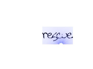
Rescue Word Art
My second word for the Word Art project was "rescue". I used the Tall Paul font, and a little bit larger font size so that I could get a different effect out of it. I used a super nova special effect, and oilified the picture to make it look "runny". I thought that this word turned out pretty cool because it almost looks like a sunrise at the bottom of the page. The effect wasn't what I was going for, but I learned to tweak it to my satisfaction.
Patriot Word Graphic
For my Word Art project, my first word was Patriot. I chose this word for multiple reasons: I like it's meaning, and I felt like I could make the graphics reflect that. I wanted this word to look simple so I chose a small size & the color blue. I used a drop shadow effect, and bent & curved the text to make it look different. I refrained from using any filters and used the simple Sans Bold font to continue the simple theme. It shows my skills because I used multiple tools to create the look I wanted.
Fireman Hoax
I decided to have fun with this project. I found a funny picture of a fireman and thougth it would be perfect for this assignment. I used the cropping tool and the opacity at level 60 as suggested. I took a picture of myself against a plain background which helped temendously, and I used a moderat brush size to erase around my head. This demonstrates my skills by showing off multiple techniques. I had to play with the opacity buttons, and shrank & inflated my head alternately to get the exact size correct.
Beautiful Building Project
My beautiful building project demonstrates my graphic design & digital photography skills in many different ways. I had to crop my original picture, I then had to pick different brushes that would best outline the different surfaces of my shed. I used the layering technique, and chose colors to show the different levels of the pictures. It was a good start to teaching me animation, and helped me feel more comfortable using the different techniques.
Photo Cropping
I took this photo of my dog, Lucky, lounging in the garden of our backyard. The first photo was crowded by bushes and leaves. When I cropped the phot, my eye was more drawn towards Lucky. By cropping the image, my focus was changed from the entire picture, to just his body. I chose this project as an example of my digital photography and graphic design skills because it was one of the first skills that I learned in this class, and it was the basis for all of my other learned techniques.
Subscribe to:
Comments (Atom)


